What is Perception?
RexLex™ was developed out of an AI project that examined the nature of perception.
When we observe things, we collect a series of ‘measurements’, using a broad mix of our senses and sense-processors: shape, orientation, 3D perspective, color, brightness, gradient, texture, size, distance, tone, volume, resonance, scent, touch, sweetness, saltiness, temperature, pressure, motion, rhythm, reflectivity, etc. These measurements, clustered together, form our memories. The clusters are then strung along in time, like the frames of a movie. Each moment, we make a new cluster of measurements and these can ‘vote’ on old clusters to connect to matching ones.
What’s round, small and yellow? The more dimensions, the faster we can identify matching memories.
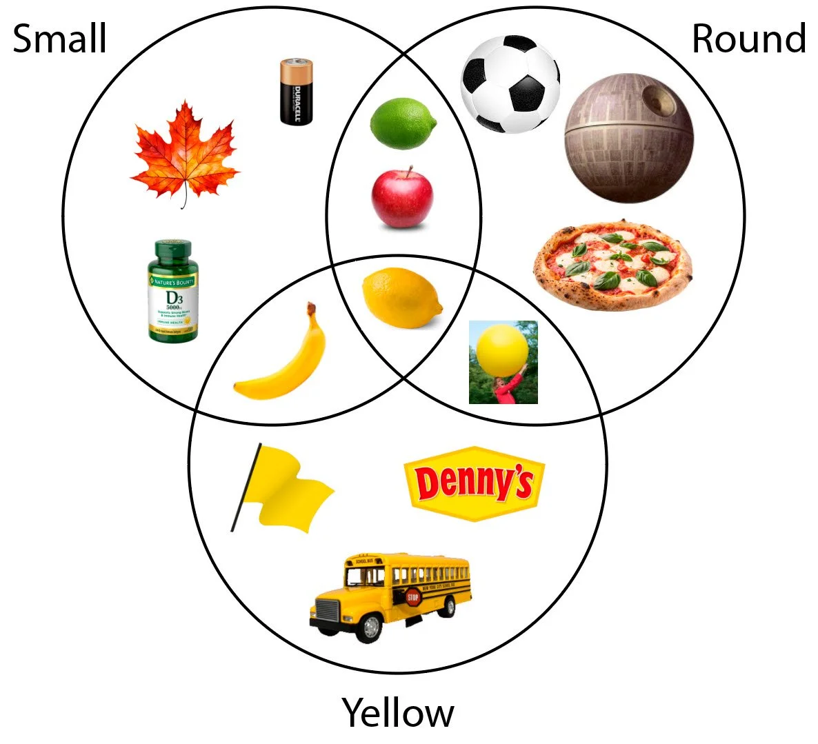
The precision of any single dimension is less important than the variety: for example, the exact shade of yellow or the exact precision of roundness can vary. Instead of detailed precision, the brain does the opposite - it uses just a small quick sampling of each dimension, reducing the precision possible for each. Instead, perception spreads the burden. It’s the ability to cross reference a wide variety that creates unique signatures, narrowing the set and connecting new observations to old memories most quickly.
The More Dimensions the Better
If we remove a dimension, the other dimensions will need to provide more precision and more samples, taking more time. For example, if we remove yellow, the ability to distinguish a lemon from a lime would have to fall back on the remaining dimensions. Limes are smaller (but with some overlap) and limes are generally rounder, (but only a little bit).
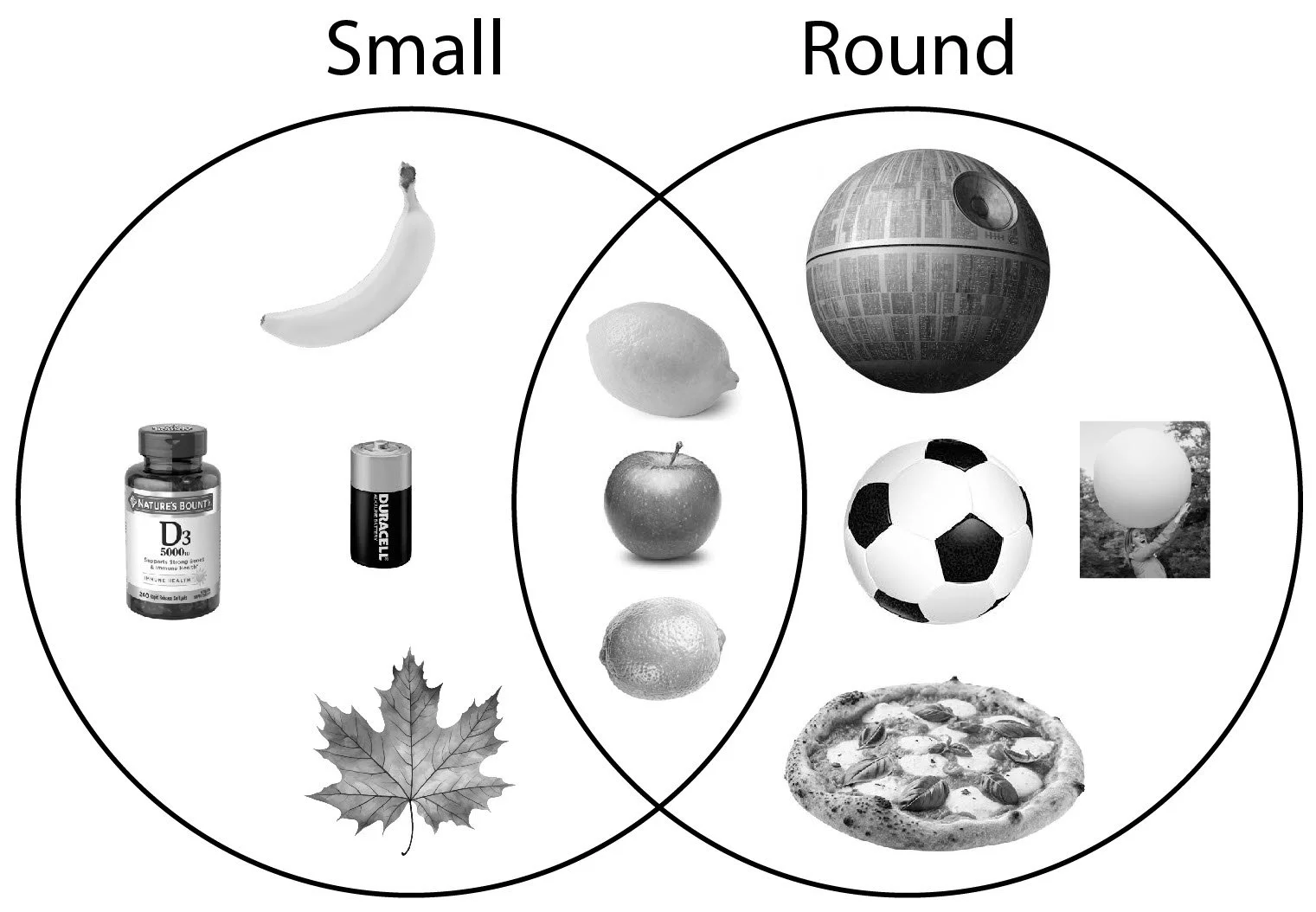
These distinctions are possible but slower than cross-referencing color. Search frames can be as short as 1/75th of a second. Precise measurements likely take more than one search frame and have a higher error rate, causing double-takes. This can require more focus on the process of perception rather than the memory being perceived. In other words, rather than proceeding on from lemon to lemonade and limoncello, you’re sidetracked into still distinguishing between lemon or lime
Removing any dimension makes identification slower and less accurate. Black and white (B&W) text unnecessarily imposes full colorblindness as a relic of pen and paper. It even lacks grayscale, eliminating the ability to cross reference brightness. Using a broad measurement mix ensures that any deficiency of one dimension can be compensated for by the multitude of others. Exclusive reliance on shape creates what engineers try to avoid: a “single point of failure.” Removing color puts more pressure on what’s left: shape. Any deficiency with shape measurements, even a processing delay of milliseconds or a lower sampling rate, can cause the system to glitch - it may return results in one frame, then change them in the next.
Just as observation processing is limited by B&W, so is memory formation. Limiting text to just 2D B&W lines contributes to memory clusters that are likewise more limited than most.
B&W is unnatural and, while most brains can compensate, a significant number cannot.
Supplementing with Clarifying Data
Lots of data causes perception challenges. In most cases, however, we don’t put the blame on the human brain but on the fuzzy input which we regularly correct by supplementing with cross referenceable dimensions of input:
Unclear TV Dialogue: we supplement with closed captions.
Misheard Lyrics: we supplement with written lyrics.
Difficult Accents: we supplement with visual information such as lip movement and hand gestures.
Audio Letters: we supplement with additional syllables: License Plate VBR574 -> “V as in Victor, B as in Bravo…”
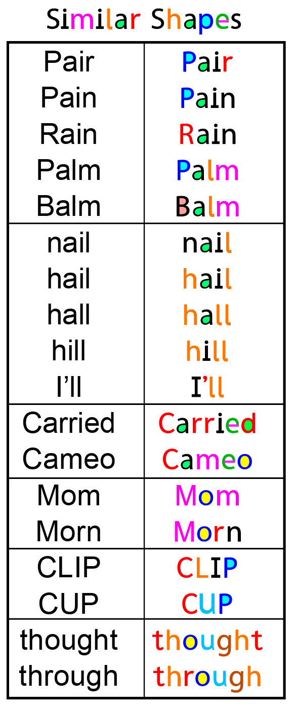
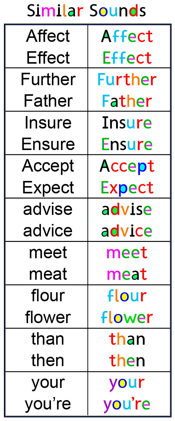
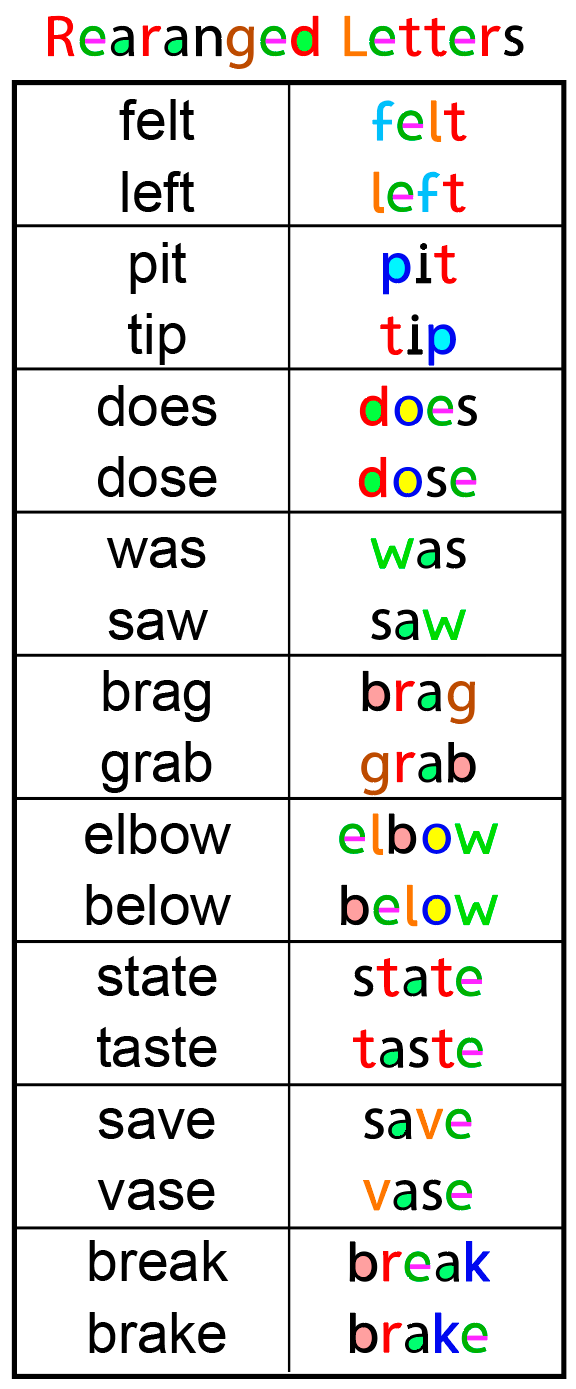
Similarly Shaped Letters: RexLex is the same tried and true remedy. We supplement by strategically adding color to shapes, fixing the indistinct input rather than forcing the brain to adapt.
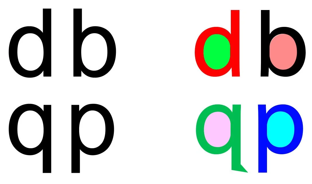
Shape-Conflicted Letters
To give an example, let’s look at these 4 letters which we call a “Shape Conflict Group”. Based on shape alone, they can be quite hard to tell apart, as they vary only by orientation. But when assigned colors, they are easy to distinguish:
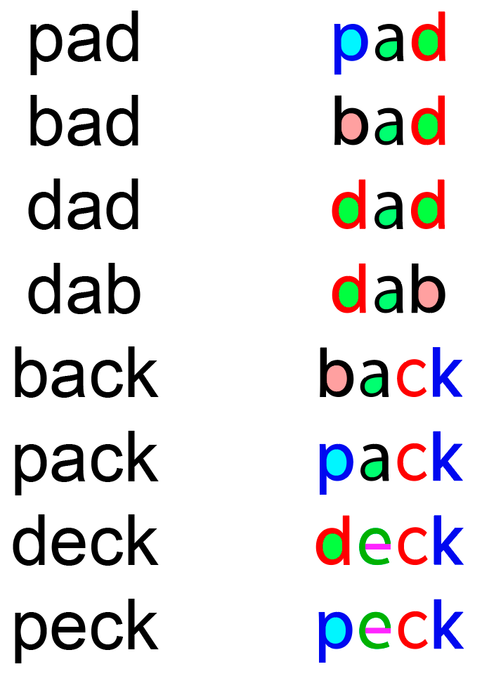
In Black and white, these word variations seem to run into each other. But by applying the colors consistently, the words are much more distinct:
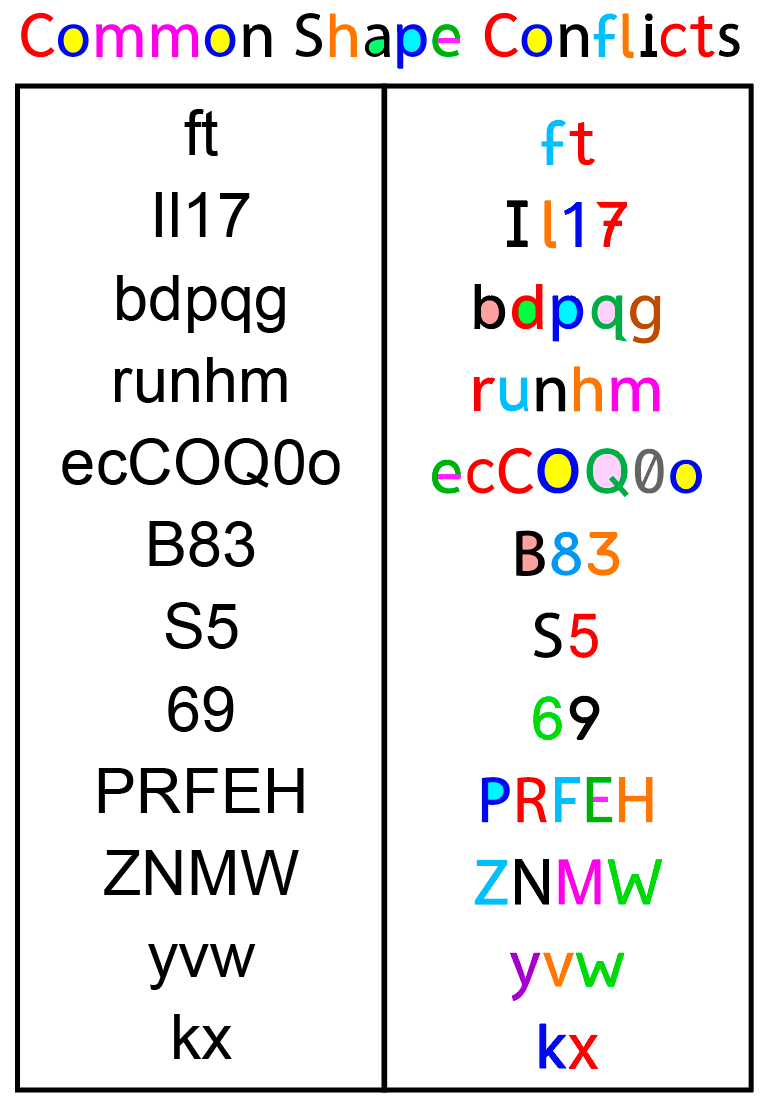
These additional “Shape Conflict Groups” show that the problem extends to much of the alphabet. Some letters are rotations, minor extensions, or slight shape modifications of other letters. By strategically coloring these, the letters become far more distinct and therefore quicker to identify:
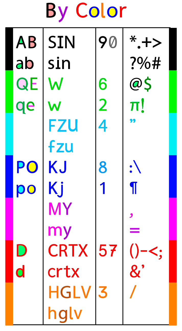
Thie next chart shows characters organized by color, rather than shape. With B&W text, each letter competes with all other characters for identification. But once the color is known the search set is dramatically trimmed to just 3 or 4 possible shapes. For example, ‘u’ and ‘n’ are identical shapes - just rotations of one another. But once the color sensors vote on ‘light blue’, the shape measurements only need to distinguish from a much smaller set and one with distinct shapes: f, z, u and 5.
Notice how the B&W words below are not distinct and can seem to run into each other. But the color versions form unique signatures, giving the brain a greater opportunity to categorize them separately.