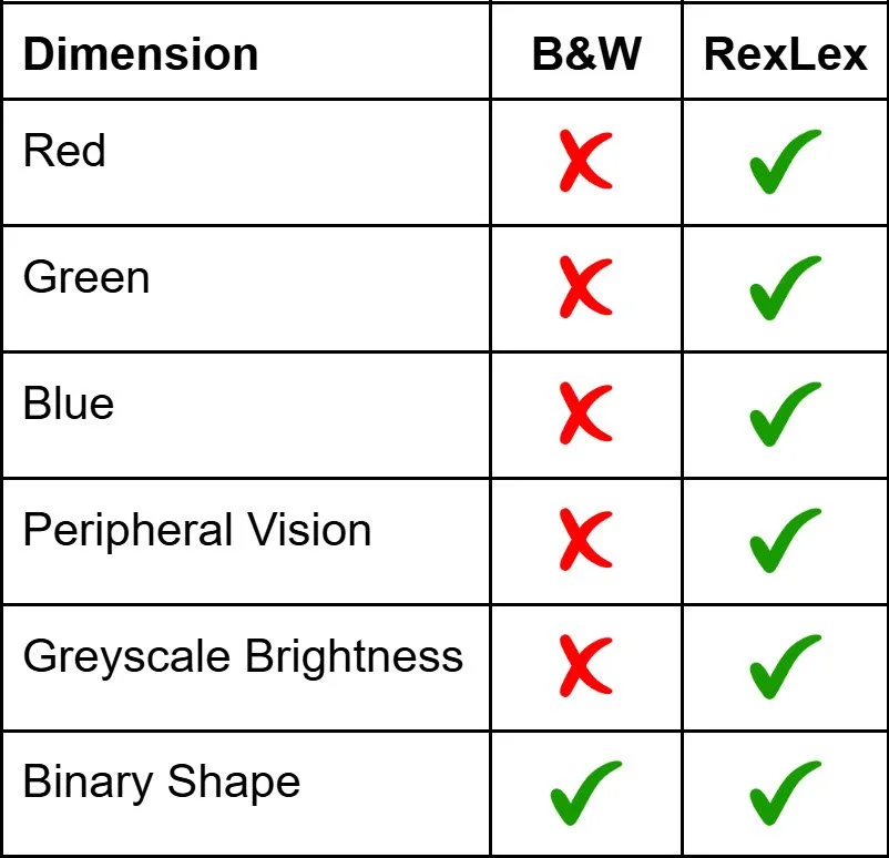
RexLex Enables 5 Types of Measurements
RexLex enables the brain to utilize additional, previously untapped, categories of measurements, compared to standard Black & White (B&W) text:
B&W text unnecessarily imposes full colorblindness as a relic of pen and paper. It even lacks grayscale. This is unnatural and, while most brains can compensate, a significant number cannot.
The brain identifies things by cross-referencing as broad a mix of measurements as it can: shape, orientation, 3D perspective, color, brightness, gradient, texture, size, distance, tone, volume, scent, touch, temperature, motion, rhythm, reflectivity, etc. As A.I. research has shown, our memories are formed by intersecting such measurements into unique combinations. Using a broad mix ensures that any deficiency of one dimension can be compensated for by the multitude of others.
Regular text is limited to just 2D B&W lines which creates what engineers try to avoid: a “single point of failure.” Any deficiency with shape measurements, even a delay of milliseconds, can cause the system to glitch.
RexLex restores 5 types of measurements that perception uses in everyday life, but which are cut off by limiting text to B&W.
3 Hues: Red, Green and Blue
Obviously, finding the carrots is harder in the grayscale vs color images below because there are fewer dimensions to cross-reference. Adding back Red, Green and Blue hues restore the ability to detect those hues plus all the other colors comprised of them.


Peripheral Vision:
In addition to the 3 hue sensors for Red, Green and Blue, RexLex also reengages the Peripheral Vision system. Peripheral Vision does not meaningfully decode shape - Shape detection is primarily effective only in the eye’s narrow ‘focal point’ which is just 1.5° of our visual field. However, Peripheral Vision can detect color, brightness & motion AND do so in a much wider visual field. With B&W text, these abilities are unused. Peripheral Vision can detect the brightness of the next space and thus the length of the upcoming word, but not much else. But Peripheral vision is capable of much more:
Peripheral Color: In the color image, look for corn. Notice how your eye naturally skips between likely yellow prospects. Peripheral tools, like color and brightness, process wide and fast, then tee up a short list of ranked priorities for the eye’s narrow focal point to follow-up sequentially. Without such guidance, focal shape tools can be overwhelmed, causing delay and error in their measurements.
Peripheral Brightness: In the greyscale image, look for the blueberries. The focal point can skip over the mashed potatoes because the peripheral vision can pre-select dark objects as potential blueberries. Even just the addition of variable brightness can rank priorities and relieve the burden on shape alone.
Consider that we have the ability to distinguish a colorful logo in our peripheral vision, long before we can actually detect the shape of the letters. The 200 most common words, account for nearly 60% of all words. These will take on unique color signatures which over time will allow the peripheral vision to meaningfully contribute to reading for the first time and allow the eye to turn its limited focal point to the remaining words.
Brightness
The eye can detect variable brightness in both the peripheral and focal sensors, but this ability is also not utilized by standard B&W text. Notice that this ability is independent of Hue:
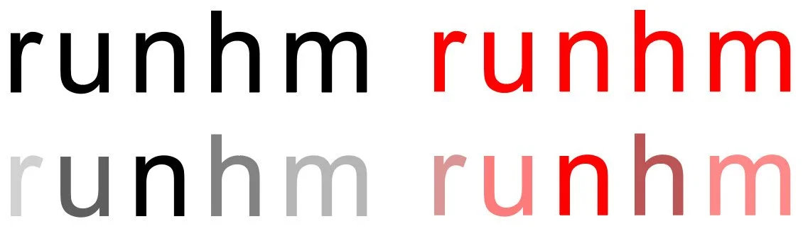
These effects apply equally to imagery and text. Flat B&W lines can be hard to separate because they are similar shapes and one color. They are unlike data we encounter in nature and have created a single point of failure, for no reason other than as a holdover from what was practical with ink and continued as an unquestioned assumption. By strategically adding red, green, blue, and variable brightness - we let the brain naturally cross-reference, and the peripheral senses naturally rank priorities for the narrow focal point. Spreading the burden beyond shape alone relieves the overload that triggers dyslexia.
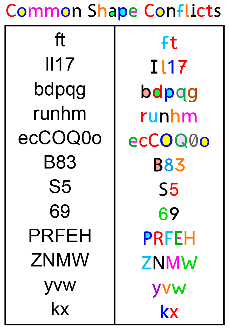
Without colors, the similar shapes of many letters can not only cause misidentification, but also cause the brain to seek to shoehorn them into unintended patterns, leading to effects seen with optical illusions: elements can seem to float, flicker, rotate or change. Notice how these letter groups are conflicted by shape, but easily separable by color and brightness. Interestingly, there’s an A.I. for this website builder that just made a “dyslexic mistake” with this image The builder is designed to put a caption to the image I pasted below for the blind. The A.I. thought that the first grouping spelled “ILL”, whereas it Identified it correctly in the color version as IL1. Creating distinct input is vital for clear identification!