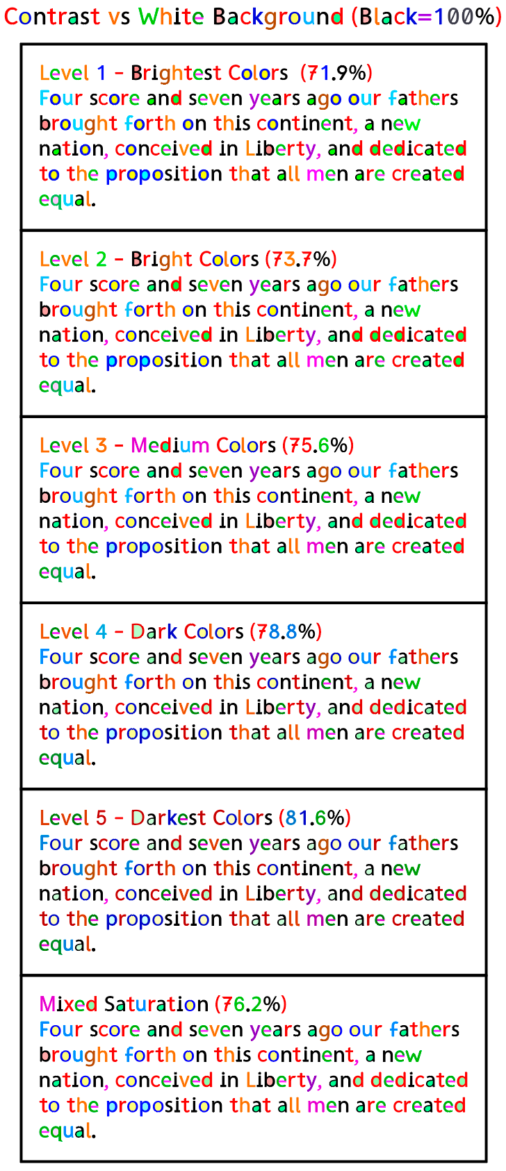
Brightness Variations
All versions of RexLex use the same basic color scheme which has been selected to give the maximum distinction between conflicted shapes - if a letter is blue in one version, it’s blue in all versions.
But while the letters are the sames hues, there are multiple variations in brightness. Pure black provides 100% contrast vs a white background, but 0% contrast between conflicted letters. RexLex divides the maximum available contrast of 100% amongst the letters themselves, thus imparting distinction. However this creates a tradeoff: the wider the spread between the letters, the closer some letters will get to the white background. We want easy to tell against the background AND easy to tell from each other BUT, there’s only so much contrast to be split between these two competing desires
The various RexLex levels give users the option to pick the right balance for them. Also each screen implements color a little differently so users have to judge which is best based on their screen and personal preference. Most people have been selecting level 3 or the one labeled “Mixed”, but it’s entirely up to each person. You may even decide that brighter colors are better in the beginning while memorizing the colors, but later switch to the darker ones of levels 4 or 5.
Level 1 has more bright primary (‘saturated’) colors but less contrast vs white.
Level 2 is still bright but some of the lightest colors, like light blue and light green have been darkened.
Level 3 is medium
Level 4 is darker
Level 5 is the darkest and easiest to see against white, but the letters are not quite as distinct from each other. Dark red, Orange and brown are similar.
Mixed - This version keeps the primary colors from level 1 if they are dark enough, but darkens the lighter colors like light blue. It keeps most of the variation in hue but less variation in brightness.